Back to Dude Intelligence for Education Main Menu
Key Performance Indicators are quantifiable measurements that show how effectively your organization is achieving key business objectives and compares your performance to peers in your industry. They are commonly used to evaluate the level of success of a particular activity or progress toward a desirable goal. These KPIs report on volume of work, efficiency, and data quality.
This data is updated every month and includes a rolling 12 months worth of data. For example, if you are viewing your KPIs in March 2017, then you will see data from the first of March 2016 through the end of February 2017.

- To download an image of the graph, click on the download icon (
 ).
). - To expand the graph you are viewing, click on the fullscreen icon (
 ).
). - To export your KPI data into an Excel spreadsheet, click on the Excel icon (
 ). *Note: This will only export the data, not the graphs.
Volume KPIs
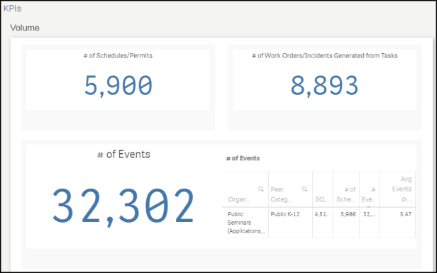
Volume KPIs show schedule, event, and work order counts according to different metrics.
Displays the number of approved and activated schedules in your account over the last 12 months.

Displays the number of approved and activated events over the last 12 months.

Displays the number of hours for approved and activated events over the last 12 months.

Displays the number of weekend hours for all approved and activated schedules over the last 12 months. *Note: Weekend hours include all of Saturday and Sunday.

Displays the number of after hours usage for all approved and activated events over the last 12 months. *Note: After hours events occur on weekdays after 4:00PM and all day Saturday and Sunday. If an event has an end time after 4:00PM on a weekday, then the total event time is included in this calculation, even if the event started before 4:00PM.

Displays the number of tasks generated from events over the last 12 months. Next to this number , you will see a chart that also shows the number of work orders generated.

Efficiency KPIs
Efficiency KPIs show how well your organization is performing according to specific metrics.
Shows the number of approved and activated events divided by the total square footage of your Locations. On the graph, you will see a small indicator that represents where your organization is performing compared to peers in your industry. Your value will be displayed in the middle of the graph.
Green - The green section displays peers in the top 20%.
Blue - The blue section displays peers that are between the median and the top 20%.
Yellow - The yellow section displays peers that are performing below the median.
Red - The red section displays peers that are performing in the bottom 20%.

Shows the number of approved and activated events divided by your student enrollment from the NCES.org database. On the graph, you will see a small indicator that represents where your organization is performing compared to peers in your industry. Your value will be displayed in the middle of the graph.
Green - The green section displays peers in the top 20%.
Blue - The blue section displays peers that are between the median and the top 20%.
Yellow - The yellow section displays peers that are performing below the median.
Red - The red section displays peers that are performing in the bottom 20%

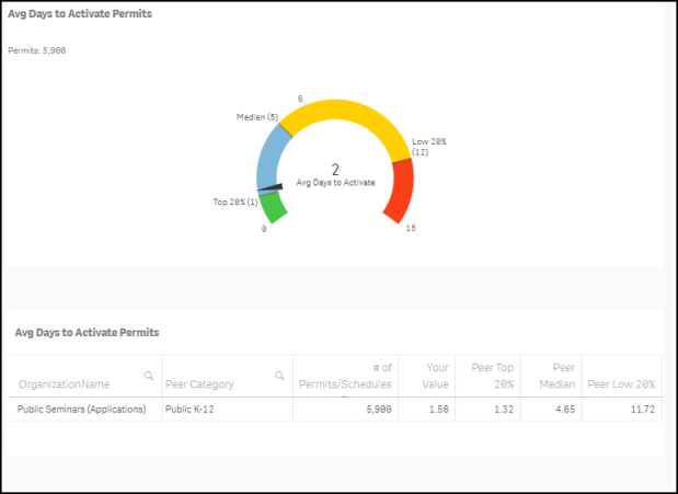
Shows the average number of days to activate permits over the last 12 months. *Note: A record is only included in the average calculation if it took between 0 and 365 days to activate. On the graph, you will see a small indicator that represents where your organization is performing compared to peers in your industry. Your value will be displayed in the middle of the graph.
Green - The green section displays peers in the top 20%.
Blue - The blue section displays peers that are between the median and the top 20%.
Yellow - The yellow section displays peers that are performing below the median.
Red - The red section displays peers that are performing in the bottom 20%

This percentage displays the number of events that have been altered or changed divided by the total number of approved and activated events in the past 12 months. In the chart, you are able to see the exact number of events that were altered/changed.

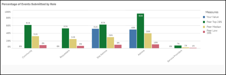
Shows the percentage of Events submitted by role over the past 12 months.
Blue - The blue bar displays your organization's value.
Green - The green bar displays peers in the top 20%.
Yellow - The yellow bar displays peers that are performing in the median or average range.
Red - The red bar displays peers that are performing below average.

Shows the amount of invoices made over the last 12 months divided by your student enrollment from the NCES.org database. On the graph, you will see a small indicator that represents where your organization is performing compared to peers in your industry. Your value will be displayed in the middle of the graph.
Green - The green section displays peers in the top 20%.
Blue - The blue section displays peers that are between the median and the top 20%.
Yellow - The yellow section displays peers that are performing below the median.
Red - The red section displays peers that are performing in the bottom 20%

Cost KPIs
Cost KPIs show dollar amounts invoiced and paid according to different metrics.
Shows the amount of invoices made over the last 12 months divided by the square footage of your Locations. On the graph, you will see a small indicator that represents where your organization is performing compared to peers in your industry. Your value will be displayed in the middle of the graph.
Green - The green section displays peers in the top 20%.
Blue - The blue section displays peers that are between the median and the top 20%.
Yellow - The yellow section displays peers that are performing below the median.
Red - The red section displays peers that are performing in the bottom 20%

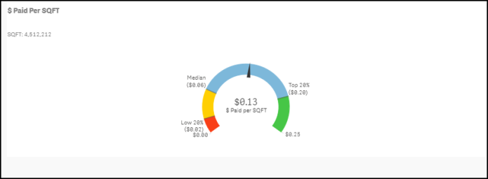
This graph shows the dollar amount paid on invoices over the last 12 months divided by the square footage of your Locations. On the graph, you will see a small indicator that represents where your organization is performing compared to peers in your industry. Your value will be displayed in the middle of the graph.
Green - The green section displays peers in the top 20%.
Blue - The blue section displays peers that are between the median and the top 20%.
Yellow - The yellow section displays peers that are performing below the median.
Red - The red section displays peers that are performing in the bottom 20%

This graph displays the dollar amount paid on invoices over the last 12 months divided by your student enrollment from the NCES.org database. On the graph, you will see a small indicator that represents where your organization is performing compared to peers in your industry. Your value will be displayed in the middle of the graph.
Green - The green section displays peers in the top 20%.
Blue - The blue section displays peers that are between the median and the top 20%.
Yellow - The yellow section displays peers that are performing below the median.
Red - The red section displays peers that are performing in the bottom 20%

This percentage displays the total amount paid on invoices divided by the total amount invoiced for the past 12 months.

Shows the total number of overdue invoices for the past 12 months. In the chart, you are able to see the exact dollar amount associated with the overdue invoices.


